Many factors play a role in determining the success or failure of your online presence, yet few are as significant as the one encapsulated in these three letters: CTA, which stands for Call-to-Action. We all encounter CTAs on the web all the time without even realizing it, but when you create a website it is imperative that you give CTAs your undivided attention.
In this post, we will clarify how CTAs work to ensure the high performance of any website, and especially business websites. We will then explore the key steps in creating powerful CTAs that bring real results, improve your website’s conversion rates and set you on the right path towards financial and professional growth.
What are CTAs?
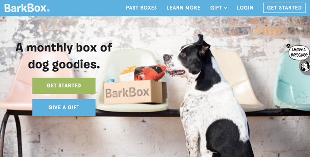
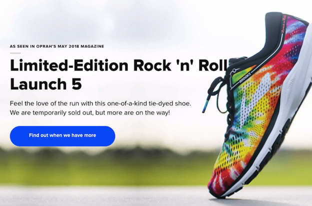
Calls-to-Action are short phrases that prompt your online audience to take immediate action. In the context of a website, they are most often clickable texts, images or buttons that encourage site visitors to follow your site’s invitation and perform a certain act, like downloading files, purchasing products, subscribing to a service, signing up as members, contacting your staff, starting a trial, and more. Here are some examples:
Basically, CTAs tell your site visitors what it is that you want them to do. If the entire content of your site is doing the prep work for it, the role of the CTA is to entice visitors to take that final step and click to complete that action, to “seal the deal.” That’s how CTAs have a direct impact on your entire website’s success. Strong, persuasive CTAs get you higher sales, more followers, wider exposure and so forth.
Now to the fun part – learning the ropes of making CTAs that have real results.
How to ace your CTAs
Define your goals
The first step to perfecting your call-to-actions takes you to the very core of your online presence. You need to have a clear understanding of your goals. Let’s put it this way: Why are you setting up a website, to begin with? What are you hoping to achieve? The answer to this question would determine how you use CTAs.
Your goal and the action that you are calling for correspond to each other. If, for example, your site’s goal is to advance your life coaching service, the action you will be prompting would be scheduling an appointment, and the CTA might read something like: “Book Your First Session Here” or “Schedule a Free Consultation.”
In some cases, you might be interested in directing site visitors to do more than one thing. For instance, you want them to purchase one of your products and like your Facebook page. In this case, you will have more than one CTA on the site and you will need to prioritize them. You may choose to have one CTA more prominent on one page and the other on another page. You may also divide your site’s layout in a way that supports both CTAs without creating a competition between them.

Know what your audience wants
Knowing what you want to achieve is one thing, but you won’t get far if you neglect to consider the wishes and needs of your audience. What are they doing on your site? What are they hoping to accomplish? What tone of voice and what kind of vocabulary appeals to them?.
It wouldn’t hurt to start this stage by doing some research on your target audience and creating a profile of your average site visitor (or multiple archetypes of visitors). If you get a sense of what motivates your audience you will phrase CTAs more effectively. Don’t be afraid to look at what the competitors are doing. You can learn plenty from other people’s successes or failures.
They can’t miss it
A CTA has to be clearly visible. We can’t stress this enough. All the effort that you put into creating your CTAs will be useless if your site visitors are unable to spot it on your site. Here’s how you guarantee that they will:
Your color palette should make the CTA stand out. Choose a color combination that accentuates the CTA and calls for attention. Obviously, you don’t want to blind your site visitors with clashing colors but you do need a contrast that helps the CTA to stand out on the page.
Size matters. The proportions of CTA buttons or texts should reflect their unique role on your site. You want to go with a size that distinctively marks the CTA as a crucial segment of the site, one that shouldn’t be overlooked. But practicing moderation is a good move here too. Devoting half of your page size to a button will not get you much other than frustrated visitors.
Location is key. Where you choose to place the CTA can have all the impact on its performance. The guiding principles are that CTAs should be located in prominent spots; that the space surrounding them should be free of clutter; and that they are not competing with other buttons in the area over clicks. You shouldn’t assume that CTAs work best if placed right at the top of the page. Remember that you are asking visitors to take action, so the request should appear at the moment when they’re ready for it. The CTA usually follows content that prepares the ground for it.
Keep it short and clear
This is not the place for witty observations or lively descriptions of the benefits you promise. CTAs are brief and to the point. They describe the action in a straightforward manner – Download Your Copy, Register for a Free Trial, Buy This, Sign Up and Get $50 Off, Reserve Your Seats, etc.
This type of copywriting may sound a bit bland, or even off-putting in its directness. Don’t forget, though, that the CTAs are just that final step in a process. Your site’s design, the images that decorate it and the textual content that you publish on it all provide the atmosphere, the information and the motivation to follow your call-to-action, while the CTA is there to give it a final push.
Use action-oriented language
Compelling site visitors to take action requires proactive language. It’s no coincidence that CTAs begin with a powerful imperative verb that assertively determines what happens next. This type of explicit invitation increases people’s motivation to follow your CTA and complete the action. It puts the focus on them and their decision and strengthens their confidence in the choice to click onwards.
The time is NOW
Similarly to the use of power-verbs, adding a sense of urgency strengthens the CTA’s impact. A powerful CTA motivates site visitors to take immediate action, not to think things over and probably forget all about your site. Adding words like “Now,” “Here” “ “Today” to your CTAs helps to prompt quick reactions. Other phrasings that elicit this type of determination are: “Get Instant Access,” “Grab Limited Discount Code” or “Take Advantage of Our Best Deal Ever.”
Lead with incentives
When you’re asking your site visitors to do something for you, you better be willing to do something for them in return. With an abundance of options and information available online, web users have the power to consider costs and benefits and make informed decisions. If you want CTAs to appeal to that mindset you need to make sure the value that you are offering is clear, and that it actually appeals to your group.
For example, CTAs like “Start My Free Trial,” “Create Your Own Blog” or “Download Straight to Your Device” all offer a certain incentive that allows visitors to visualize what they are getting out of this deal.
Don’t neglect the rest of your site
This article focuses specifically on the art of creating CTAs, but just as important is the art of creating a good CTA environment. Remember, the CTA is a culmination of your pitch to your site visitors. Even the perfect CTA will fail if the site that surrounds it does not lead visitors towards completing the action.
To begin with, your entire site design should support the CTA. This means, for example, that the layout of the page should direct the visitors’ view towards the CTA in a natural browsing flow. It also means freeing up some white space around the CTA, to make sure that nothing distracts the view away from it.
The site content is also crucial for the elimination of FUDs – fears, uncertainties, and doubts. We mentioned before that CTAs are short and therefore cannot address all the concerns or questions that site visitors might have about you, your business or your organization. You need to make sure that your site has all the answers so that visitors are free to pursue the CTA freely.
Track and analyze success
No serious website owner would be pleased with following all the steps mentioned above without tracking their impact. Analyzing the success rate of your CTA is crucial in evaluating your site’s overall performance and is a vital step towards improving your strategy for growth. An important metric that can help in guiding your evaluation is the conversion rate, which basically provides you with the tools to measure your CTAs’ success rates.
Test and improve
After tracking and measuring your CTAs’ performance, you have the knowledge required to experiment, compare and improve various call-to-action schemes. Your analysis may show you that some colors bring in more clicks than others, or that the phrasing “Buy Now” is more effective than “Purchase Now.” Keep track of your different tests to better understand what triggers action with your target audience and continue to improve your CTAs accordingly.